Case Studies:
SAMUEL HUDSON
Creative Technologist | Designer | Audio Producer
I’m a multidisciplinary designer with a background in interactive media and digital experiences. My work sits at the intersection of visual design, interaction, and technology—crafting experiences that are as intuitive as they are emotionally resonant.
I’ve led the creation of two highly-rated video games, guiding teams of artists and designers while shaping every aspect of the design process—from concept and systems design to interaction, usability, and final polish in Unreal Engine. My focus is always on creating cohesive, accessible experiences where form and function reinforce each other.
Beyond visuals and interaction, I also design sound and music using Ableton Live—building audio landscapes that deepen immersion and strengthen narrative flow. This integration of sight, sound, and system design helps ensure every project feels complete, connected, and purposeful.
Whether it’s developing an interface, defining a user journey, or crafting original audio, I approach design as a holistic practice—balancing creativity with clarity, aesthetics with intent. My goal is to make work that feels alive, grounded in thoughtful design and shaped to resonate both visually and emotionally.
Contact: sahudsondesign@gmail.com
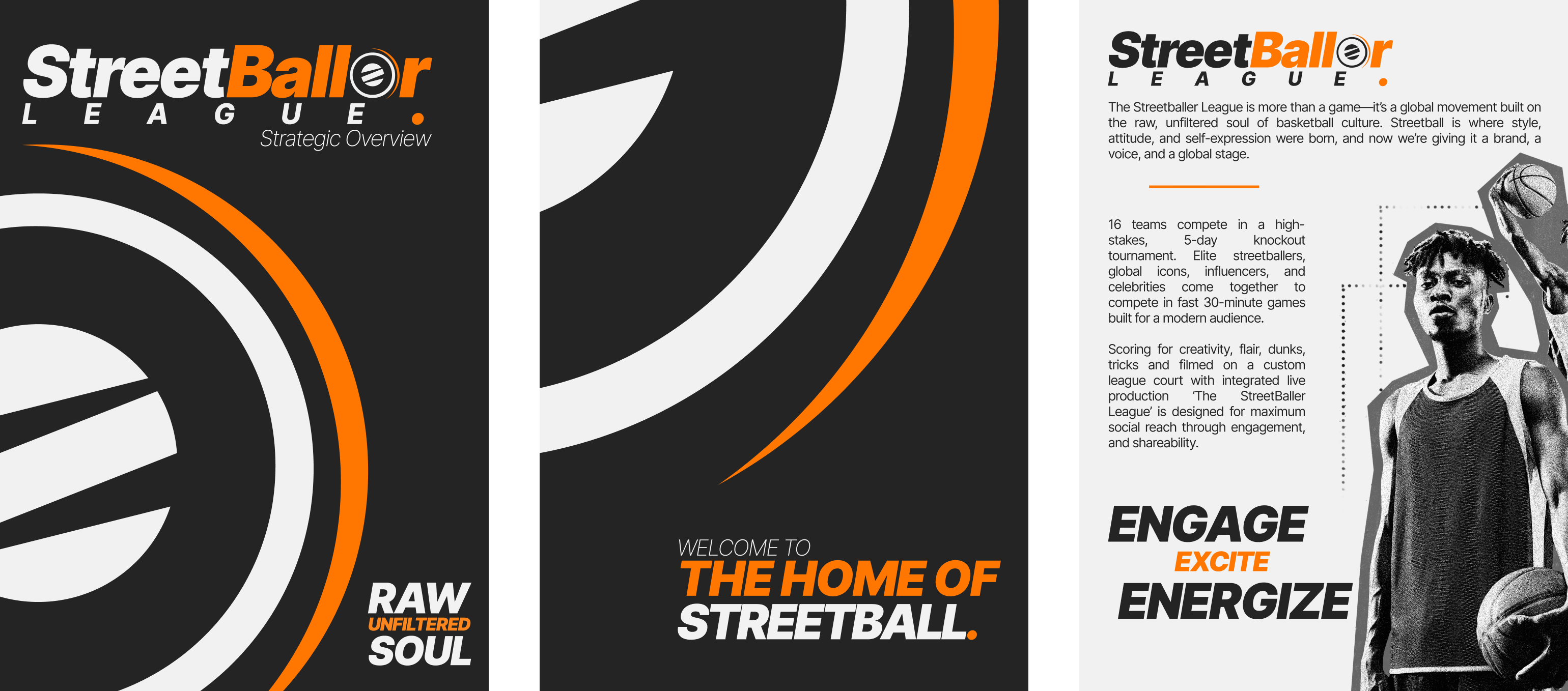
STREETBALLER LEAGUE
Brand Design, Commercial Pitch Brochure & Website - GRAPHIC & UI/UX DESIGN
The StreetBaller League brand was developed to position a streetball league as more than a game — as a global cultural movement. The design captures the sport’s raw authenticity while presenting it through a bold, contemporary lens. The layout uses dynamic geometry and high-contrast composition to reflect energy, rhythm, and competition. Black and white create a foundation of strength and clarity, while orange injects passion and intensity — the heartbeat of the league. Every element, from the circular emblem inspired by a spinning ball to the strong typographic balance, reinforces the idea of motion, impact, and unity. The result is a visual system that feels powerful, modern, and unmistakably street.

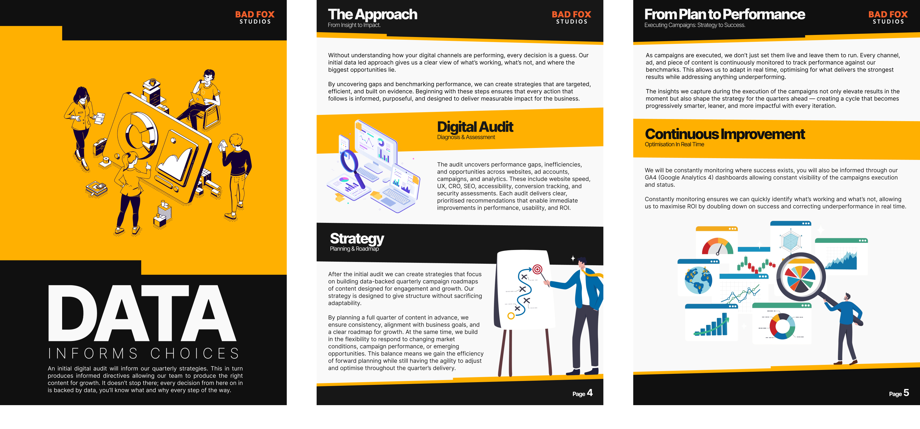
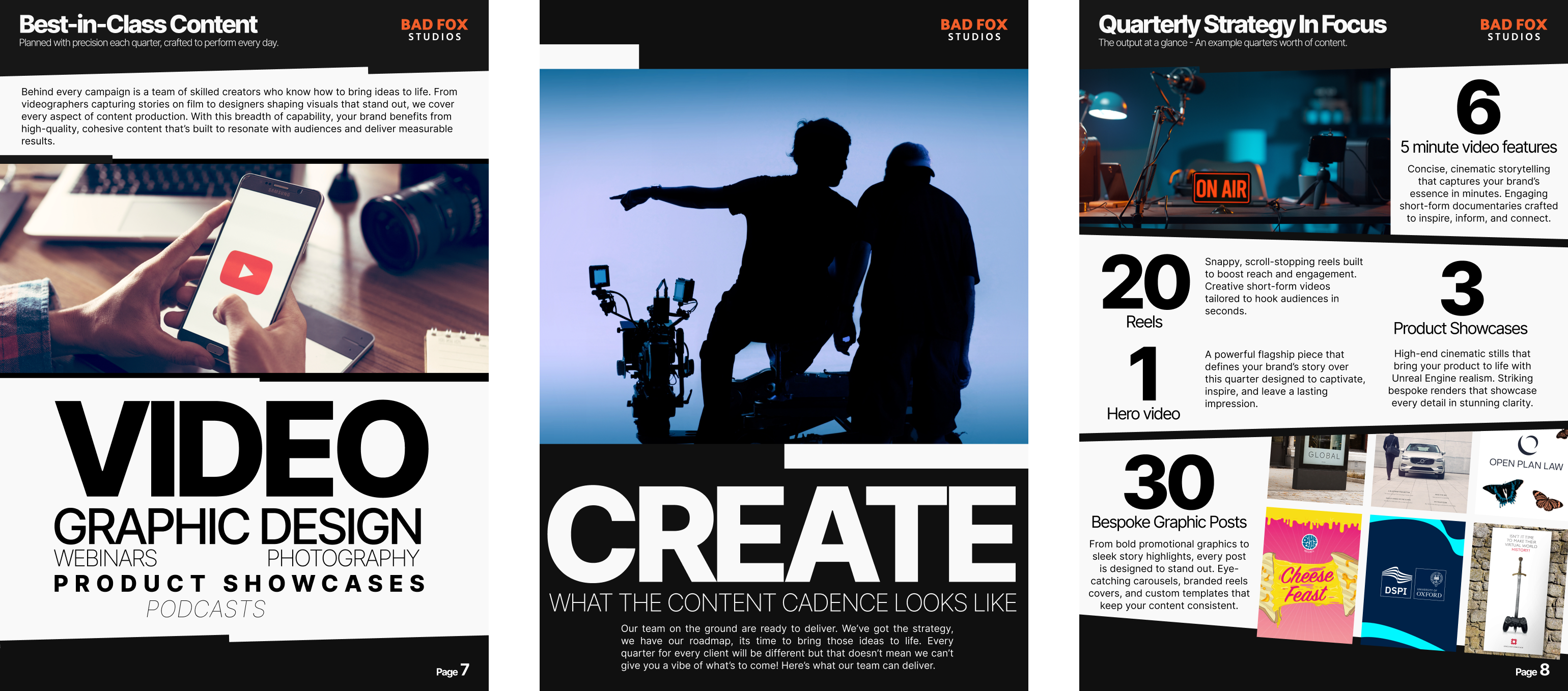
DIGITAL MEDIA CAMPAIGN STRATEGY
Brand Design, Commercial Pitch Brochure & Website - UI/UX DESIGN
The digital campaign pitch brochure and website was designed to communicate clarity, precision, and confidence. Each section—whether focused on creative strategy or data analysis—follows a modular visual system that makes complex information feel accessible and actionable. Bold typographic hierarchy and structured layouts guide the reader through each stage of the campaign, while consistent use of color and iconography reinforces key themes of innovation, progress, and collaboration. The minimalist aesthetic ensures that the focus remains on content and strategy, giving the client a clear, visually engaging overview of how the campaign will unfold from concept to execution.
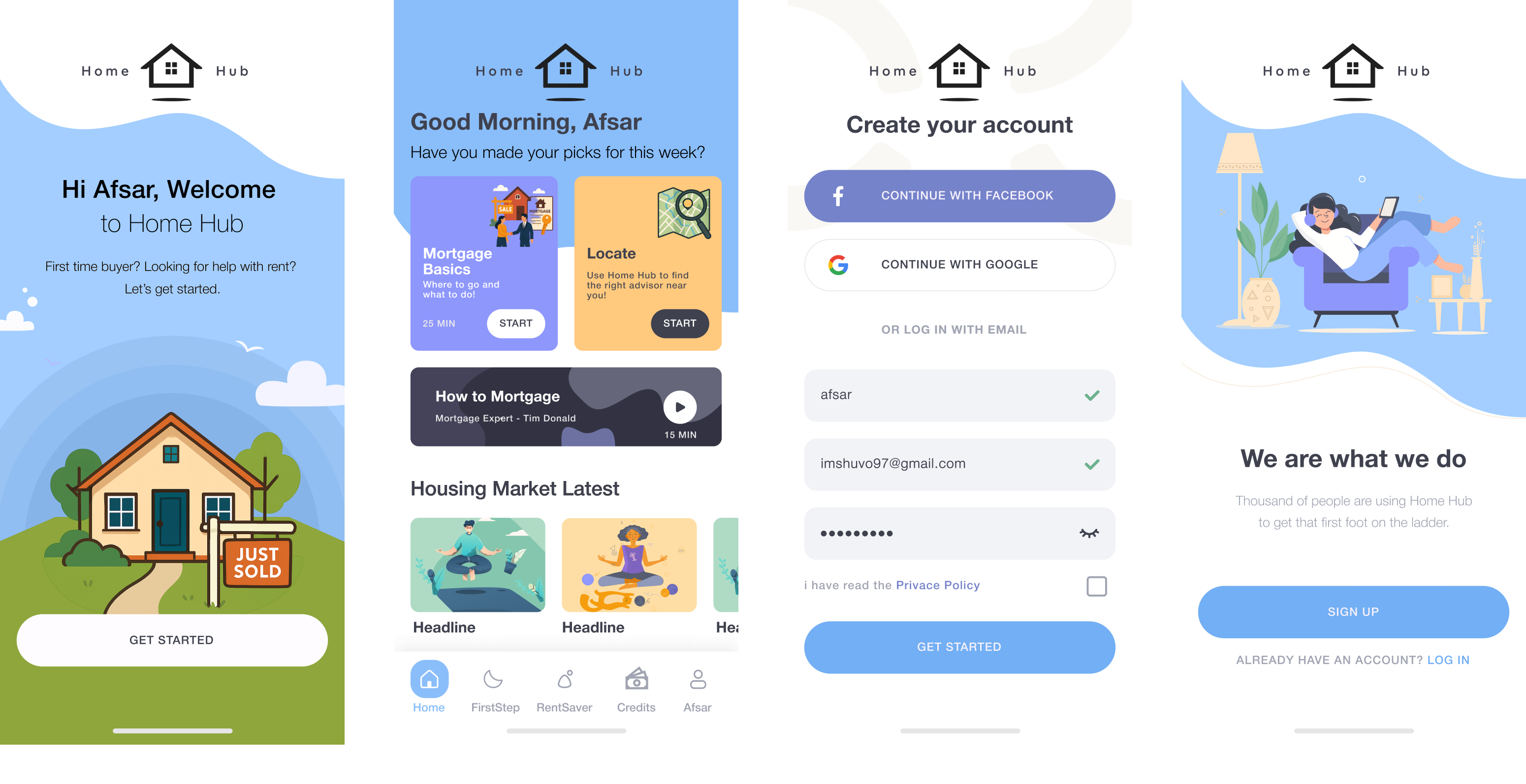
HOME HUB
Brand & Mobile Application Design - GRAPHIC & UI/UX DESIGN
The Home Hub app was designed to make navigating the housing market simple, supportive, and human. The interface uses soft colours, friendly illustrations, and clear typography to create an approachable experience for first-time buyers and renters. The layout prioritizes ease of use, with intuitive navigation and quick access to essential tools and learning resources. Every screen is built around reassurance and empowerment — helping users feel at home from their very first interaction. The result is a digital platform that balances professionalism with warmth, turning complex financial steps into a guided, confidence-building journey.

SWIFT FIT
Brand Design & Various Pitch Pieces - GRAPHIC & UI DESIGN
The SwiftFit identity was created to reflect the product’s defining feature — a lighting fixture that installs with speed, precision, and simplicity. The logo combines clean geometry with a sense of motion, symbolizing the effortless “swift fit” action of the product. The intersecting ring and bird-inspired form evoke fluidity and technical innovation, while the bold typeface communicates reliability and modern engineering. The use of orange and blue creates a balance between energy and trust, positioning SwiftFit as both dynamic and dependable. Alongside the brand identity, I also developed the website and a range of supporting materials, ensuring a unified visual language across all customer touchpoints.
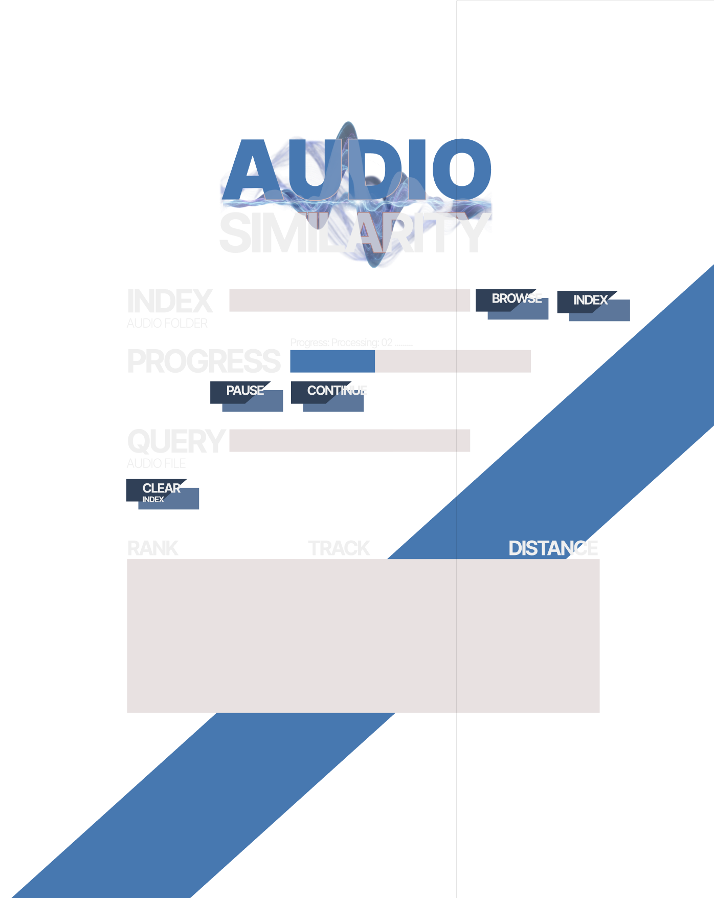
AUDIO SIMILARITY
Audio Organising Application - GRAPHIC & UI/UX DESIGN
The Audio Similarity interface is designed around functional clarity and data-driven workflow. Its layout prioritizes the sequential process of indexing, querying, and evaluating similarity, reducing visual noise to keep the user focused on analysis. The bold typographic hierarchy and restrained colour palette create a strong contrast that supports readability under extended use. Blue accents highlight active states and progress, reinforcing a sense of motion and computation. Overall, the design emphasizes precision and efficiency, aligning the visual language with the app’s purpose — analysing and sorting music by underlying acoustic and perceptual similarity rather than conventional metadata.
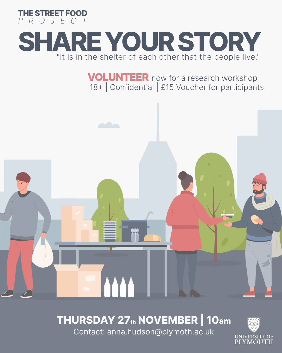
THE STREET FOOD PROJECT
Research Project Social Media & Print Outreach - GRAPHIC DESIGN
The Street Food Project poster was created to communicate warmth, dignity, and community through a clean, approachable visual style. The design uses soft colors and simple illustration to humanize the message and make it inviting rather than clinical. The layout directs attention to the call-to-action — “Share Your Story” — emphasizing participation and empathy. Subtle urban elements in the background ground the scene in a real-world setting, while the clear typography and structured hierarchy ensure accessibility and clarity. Overall, the design balances professionalism with compassion, reflecting the project’s goal of connecting people through shared experiences and stories.